• Home
  • Our Services
    • Branding / Logos
    • Design for Print
    • Digital Design
    • Animation
    • Signage, Banners, Exhibition
    • Foyer Charity Work
    • Creating a difference
    • Our new name
    • Our new logo
    • Our values
    • Aberdeen Foyer
    • Our Clients
  • Contact
Menu

Foyer Design

Transforming ideas into impact for 25 years
  • Home
  • Our Services
  • Portfolio
    • Branding / Logos
    • Design for Print
    • Digital Design
    • Animation
    • Signage, Banners, Exhibition
    • Foyer Charity Work
  • About us
    • Creating a difference
    • Our new name
    • Our new logo
    • Our values
    • Aberdeen Foyer
    • Our Clients
  • Contact

Branding / Logo Design

New branding design • Brand guidelines • Brand refresh update • Icon design

Please see below just a few examples of our work, to show the breadth of clients we have worked for. If you wish to get in touch to discuss your logo or branding requirements, please do drop us a call (01224 562865) or email: julie@foyerdesign.co.uk

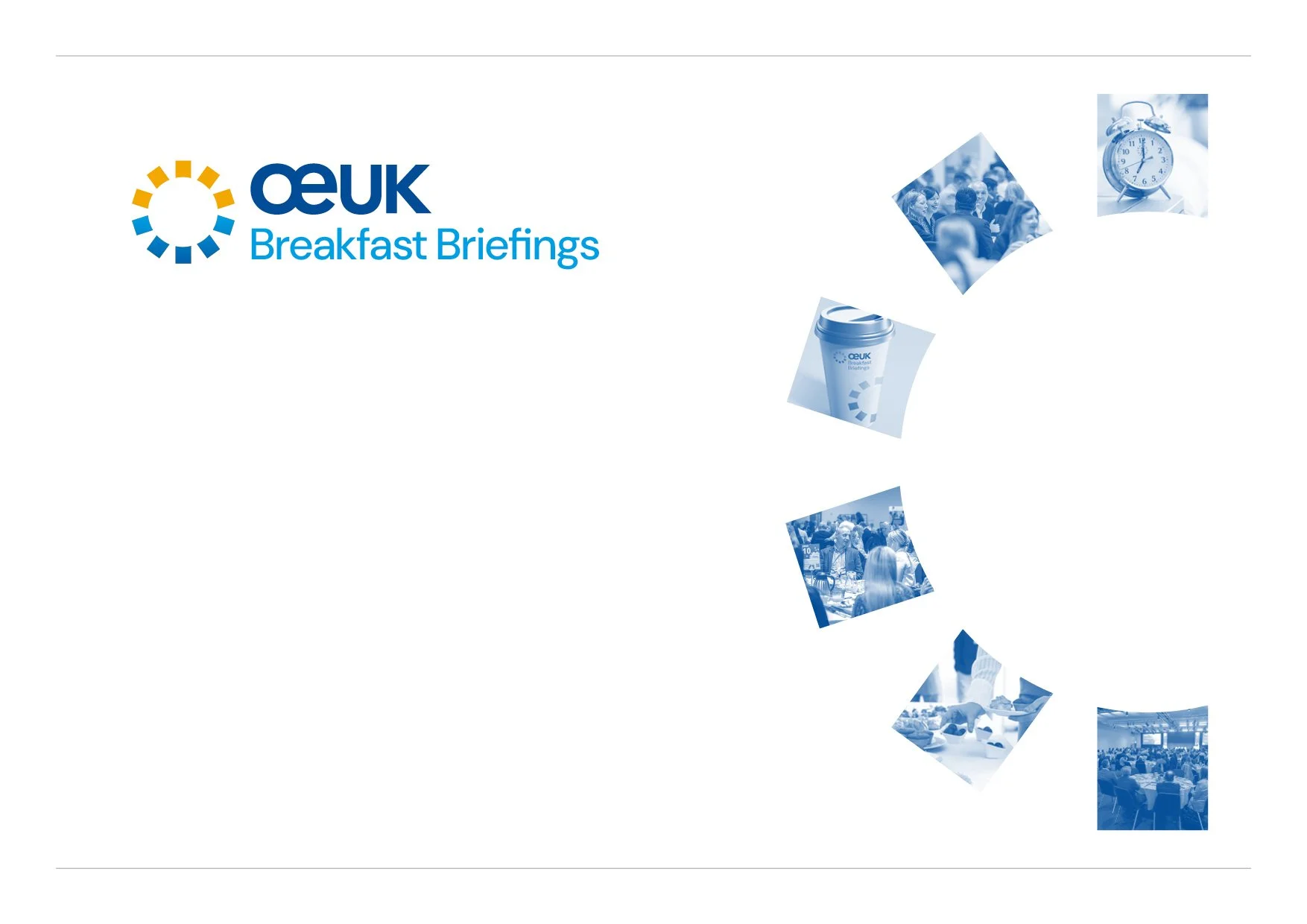
OEUK Event Branding

We were tasked with designing a cohesive family of event logos for OEUK, each maintaining a connection to the main brand while allowing for distinct identities. Every logo integrates a unique shape that aligns with the broader brand aesthetic while introducing fresh colours and imagery for each specific event.

OEUK Conference Branding

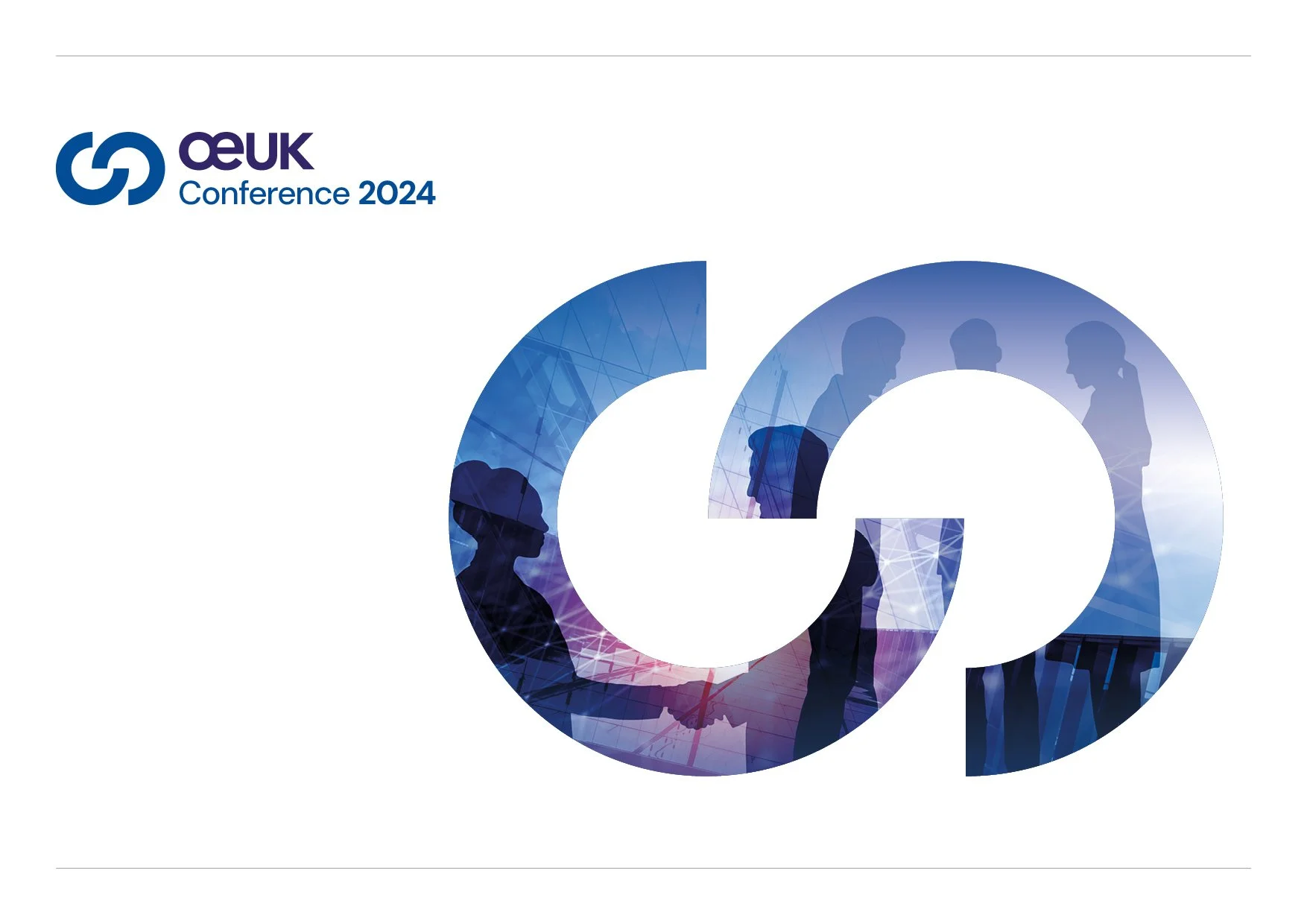
For the OEUK Conference 2024, which gathered over 350 delegates from industry leaders to government officials and innovators, the logo symbolises collaboration and partnership. The shape reflects themes of connection, with elements representing people meeting, shaking hands, and forming lasting alliances.

OEUK Awards Branding

As one of the most anticipated events on the industry calendar, the OEUK Awards provide a unique platform to honour the innovations, dedication, and excellence that drive the sector forward.

Our concept for the Awards logo centers around a star emerging from the letter ‘A,’ symbolising excellence and achievement. To reflect the theme of celebrating the brightest talents in the field, we incorporated twinkling stars and a touch of gold dust. This design embodies the spirit of the evening—a night dedicated to honouring the remarkable accomplishments of individuals and organisations.

OEUK HSE Branding

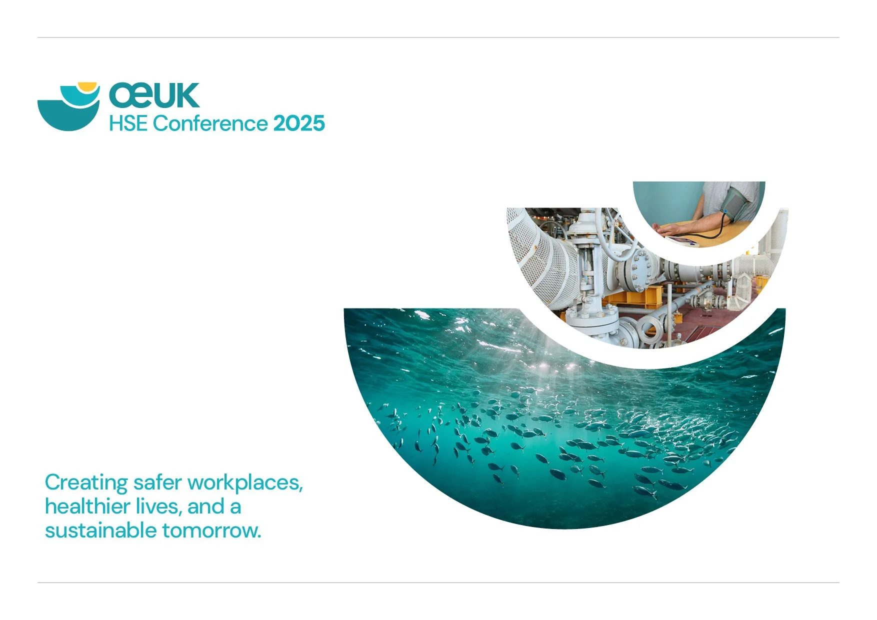
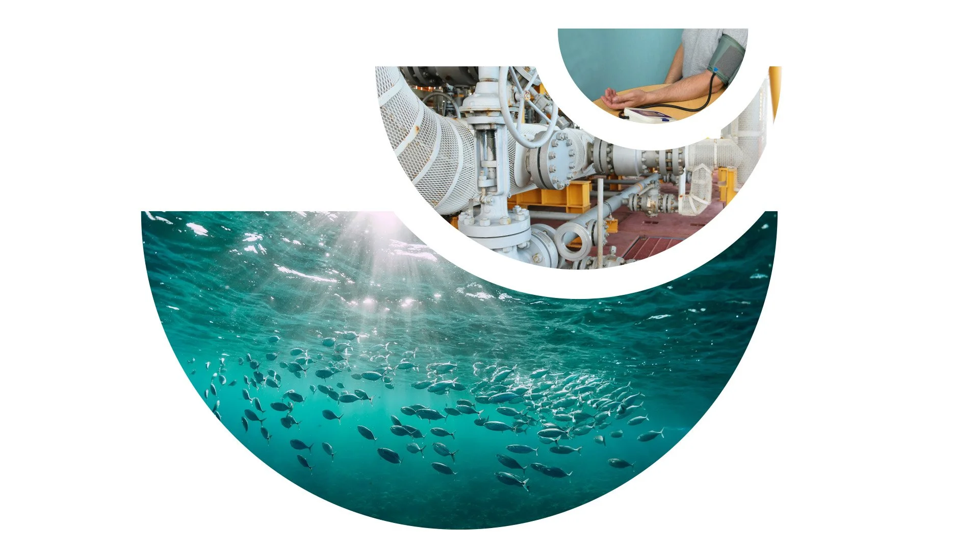
The concept behind this logo is rooted in the event's core focus: Health, Safety, and Environment. Each shape represents one of these key areas. At the top is a symbol for personal health, followed by a surrounding shape that embodies workplace safety. Together, they rest on a foundational shape representing the protection of the broader environment. This layered design visually reflects the interconnectedness of these crucial elements.

Share Fair Branding
Share Fair Branding

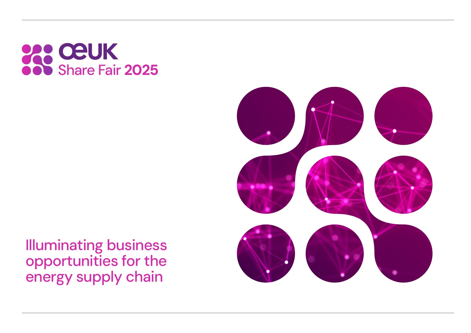
The concept behind this logo is a simple shape that depicts a network coming together and sharing. It is a key business development event in the industry calendar. We used vibrant colours, which reflects the dynamic energy and opportunities associated with this event.

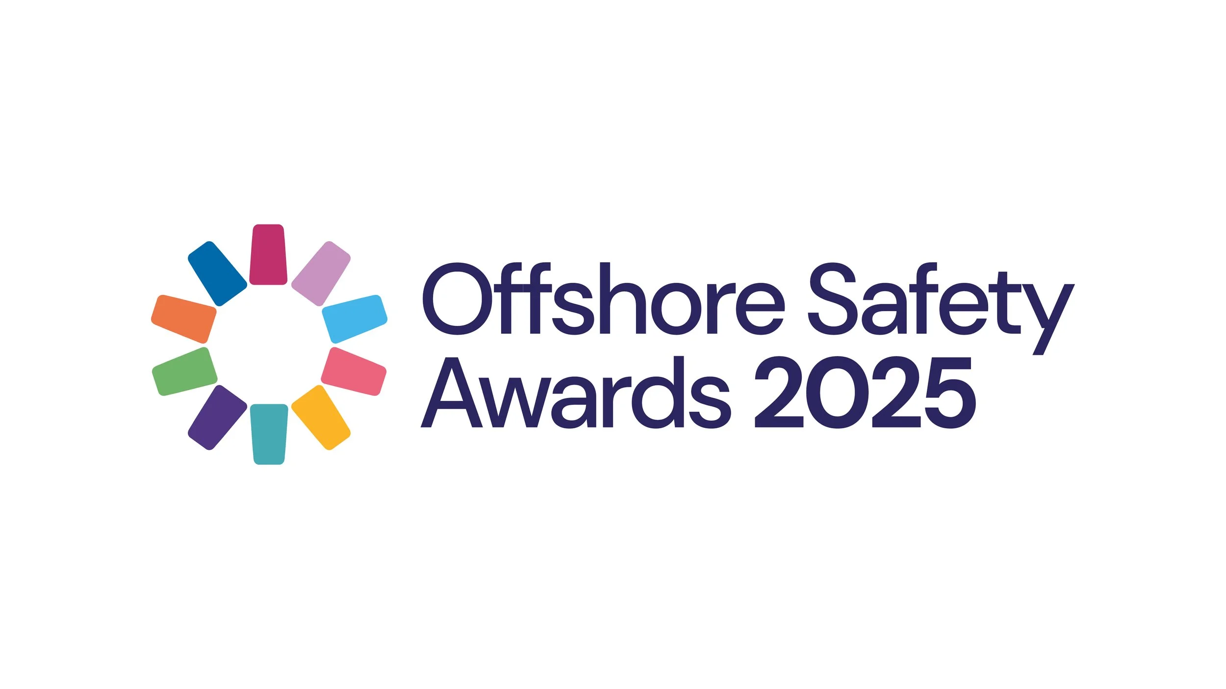
Offshore Safety Awards 2025

Design of event logo for the Offshore Safety Awards 2025

Jointly organised by Step Change in Safety and Offshore Energies UK (OEUK), this event recognises the individuals, teams, and organisations going above and beyond to improve safety performance across the industry.

The logo design reflects the 10 award categories coming together to champion offshore safety. Each having their own individual colour and segment of the working cog - A symbol of working together.

 Powerpoint side

Powerpoint side

 Banner

Banner

 Utilised on website by client

Utilised on website by client

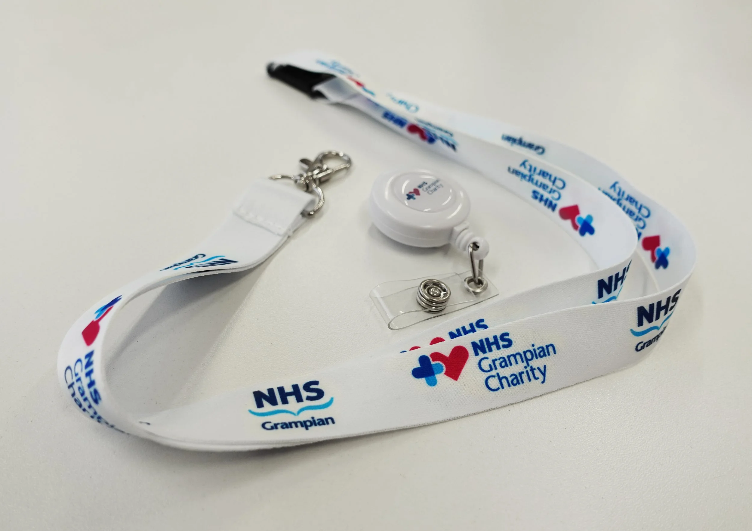
NHS Grampian Charity

We were asked to develop a re-brand for the NHS Grampian Endowment Fund charity. The name would be changing to NHS Grampian Charity and a new logo would be needed. Working with the team at NHS, we created a presentation of ideas that encompassed their values, their mission and worked within the NHS brand guides. The resulting logo was a simple bold shape, using 3 hearts that represented adding value to NHS through fundraising and donations which are used to provide benefits for NHS staff and patients, to enhance services, and to provide support in communities.

NHS-Charity-Logo.gif
DSC00258.JPG
Doc_Mockup.jpg
Mockup_Rollup_side_85x200.jpg

Halliday Fraser Munro - Logo design / identity

We created a new and unique identity for the long established and well respected Architect firm Halliday Fraser Munro in Aberdeen. The logo uses negative and positive space to create the three letters HFM and also reflects a building structure. The new identity has been rolled out across their materials; business cards, letterheads, flyers, adverts, exhibition stands etc.

HFM_logo_on White.jpg
HFM card mock up.jpg
A5 flyer.jpg

Cfine - Community Foods Initiative North East

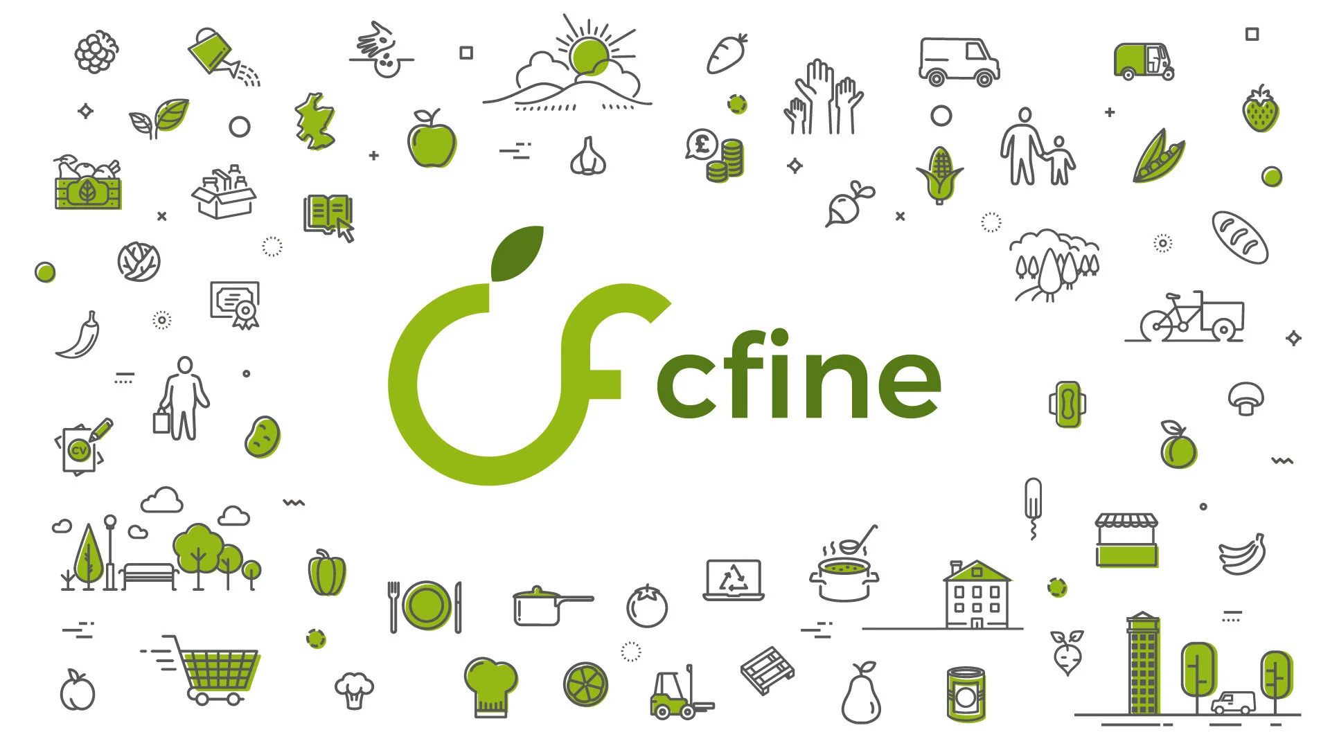
We’re delighted to have been able to support CFINE in creating its refreshed brand image, bringing the personality of the charity to life. As part of Aberdeen Foyer, and a social enterprise ourselves, Foyer Design is especially proud to support CFINE, with whom we share similar values and aspirations.

CFINE provides fundamental and vital support to people experiencing poverty within our local community and we were keen to ensure the new brand respected its core purpose but also provided a nod to the current and future aspirations of the charity.

Here you can see the main cfine logo with a set of support icons, representing their breadth of services. We quickly realised we had to create something to reflect their range of fantastic services, cfine is not just a food bank. We have a ‘wallpaper’ pattern of icons that can suit various applications and uses. We’ve also created flexibility for the client, by introducing sub-brands that can evolve with their future plans.

Cfine Banner.jpg

Elements Restaurant Brand

We had the pleasure of collaborating with Gael Cordiner on designing the logo for Elements Restaurant, a fine dining gem in the heart of Bearsden, Glasgow. Elements embodies 'essential, characteristic components of a composite entity'—a concept that perfectly aligns with the logo elements symbolising Air, Fire, Earth, and Water.

Elements Restaurant, led by renowned Head Chef Gary Townsend, is passionate about delivering exceptional food and service, utilising ingredients sourced from Scotland’s most committed producers and farmers.

Their evolving tasting menu and à la carte options for evening service, along with a delightful four-course menu for lunch, offer guests an enticing and exploratory food experience in a relaxed and welcoming setting.

col on blue.jpg
col on paper.jpg

Spirit of Speyside Whisky Festival

The Spirit of Speyside Whisky Festival's annual celebration of Whisky has developed into one of the largest events of its kind anywhere in the world. With a programme of over 600 whisky-inspired events over 6 days, it takes place throughout Speyside, the biggest whisky producing region in Scotland, located in the Moray area in the North-East of the county between Aberdeen and Inverness.

Foyer Design were asked to create a re-brand which would bring a fresh approach that allowed a parent and sub-brands, adaptable to various mediums and appeal to the diversity of its audience.

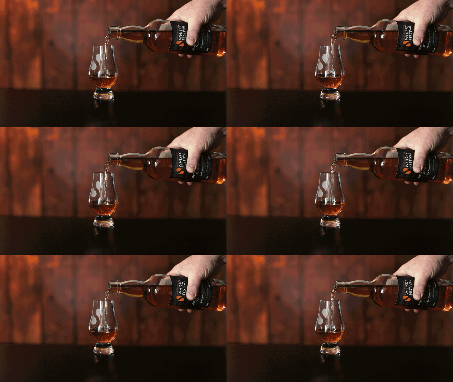
Whisky Festival branding
Cinemagraph created (blend of photo and movie)
Speyside Trophy.jpg
Label Mockup V2.jpg
Brochure Mockup2.jpg
Gin Experience
Gin Experience

Part of the Spirit of Speyside family of branding - Gin Festival

Banner Mockup.jpg
Postcard Mockup.jpg

Huntly Development Trust

We were delighted to have tendered and won the opportunity to work with Huntly & District Development Trust on refreshing their brand and sub-brands, so that they had a consistent and considered set of logos and supporting materials.

Huntly had a strong town branding symbol that the Trust were keen to retain in some way. The antlers were therefore developed to represent the community and landscape that tied everything together. The antler symbol can be seen within the sub-brands, but treated in a slightly different way - each has their own shape, set of colours and tagline.

HDT Banner.jpg
HDT Stationery.jpg
HDT Sign Mockup.jpg
 Huntly Travel Hub Sub-brand

Huntly Travel Hub Sub-brand

Huntly Car.jpg
 Greenmyres Sub-brand

Greenmyres Sub-brand

HFI Consulting & Legal Services

Logo design and supporting materials for HFI who provide specialist consulting and legal services to help clients expand successfully in the energy and water sectors in the Middle East and North Africa (MENA) region. Working with our client on expanding their brand across the globe for various exhibitions throughout the year, creating brochures, powerpoints, posters, info sheets and more.

Testimonial

“HFI Consulting International has been delighted to appoint Foyer Design as our design specialists. Foyer Design has played a key role in the launch of the business and is valued ongoing member of the business development and marketing team, supporting us with branding, corporate brochures, website design work and conference materials.  We highly commend their work.”

Hugh Fraser
Managing Partner - HFIConsulting International

HFI Folder Closed.jpg
HFI Folder Ajar.jpg
HFI Folder Open.jpg
HFI Stand.jpg
HFI_logo.jpg

Young Carers Aberdeenshire

Foyer worked with Aberdeenshire Council and School pupils to pull together a branding and range of marketing materials for young carers of school age. The ideas of the young students were taken on board and they ultimately chose the design they wanted. It was a great pleasure to produce their final logo, leaflets, posters and pull up banners.

z fold layout Mockup.jpg
Young Carers pull up banner.jpg
Art grid A3 poster.jpg

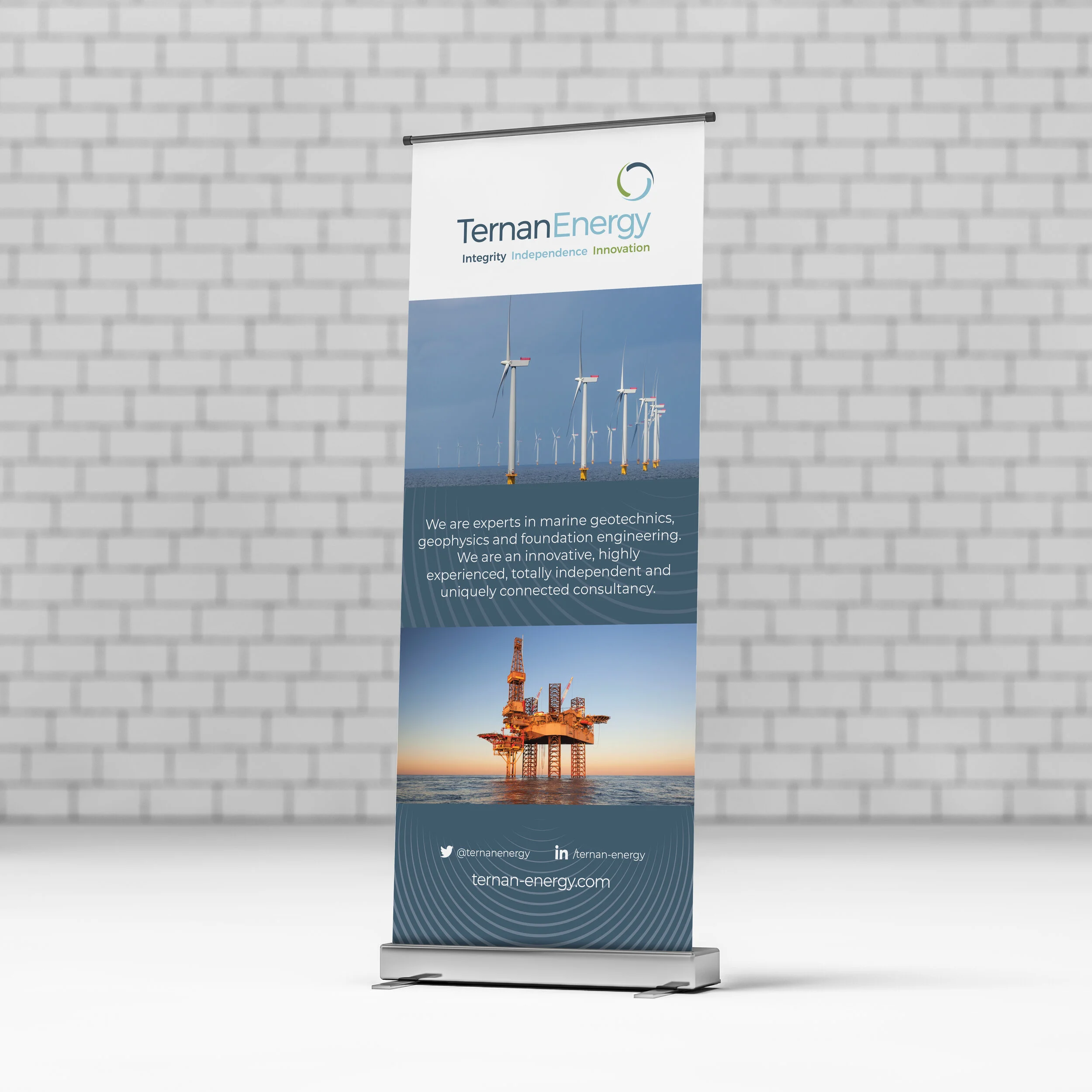
Ternan Energy

Logo refresh. We set out to improve the clients original logo, by technically drawing and creating a balanced representation of turbine blades. Colours were adjusted to align better, the font was refreshed and the end result was a sharper, balanced logo.

report cover mockup.jpg
Ternan Banner.jpg

Lightbulb Coach

We were approached by Sarah - a coaching and training consultant to come up with a new name and brand. She wanted to appeal to her target audience of young adults and offer personal development coaching to improve and brighten their futures. Our solution for Sarah uses simple clean shapes, with bright soft colours and the lightbulb concept adapts well to many uses. We also worked with a partner web developer to create the web site, we designed a set of images which reflects the brand strongly.

Testimonial

“Through a recommendation, I visited Julie at Foyer Design in 2018. I was launching my business and looking to create a brand. I wanted something bright and fresh that was simple and easily recognisable. I arranged to meet Julie who asked me about me and my business, it was so comfortable. The team provided a few options and they absolutely nailed it. I was so excited to have a fantastic logo, they also provided visuals for my website and business cards that I couldn't wait to hand out. They also suggested 3ft props (feel free to describe, add photo etc) which are great talking points and photo props. My clients love them.

Since then, I have sent Julie many requests for new website and social media photo's, christmas cards, a pop-up banner, posters and notebooks for events. I don't give much direction on what I'm looking for as I don't need to. I completely trust the team and they never disappoint. I'm always excited to see what they have come up with.

The service they provide is fast, reliable, trustworthy, uncomplicated and best of all, benefits others (being a not-for-profit).

People often ask me who designed my logo, I'm always delighted to recommend Foyer Design.”

Sarah Smith
Coach & Talent Consultant

Lightbulb.jpg
home screen.jpg
careers screen.jpg
coaching screen.jpg

Granite Care

Granite Care Consortium is made up of local 3rd & private sector providers with decades of experience in delivering health & social care services. The Consortium was set up to create market stability, improve outcomes and build a consistent trained and skilled workforce.

Working with the partners of the consortium, we created a solution that represented putting people at the heart of care within the home. The 10 dots dots represent the 10 care providers; Aberdeen Cyrenians, Ann Inspired Care, Archway, Blackwood, Inspire, myCare, Paramount Care, Penumbra, Specialist Resource Solutions and VSA.

Qualities that were considered: friendly, positive, caring, people and collaborative working.

business card mockup GCC.jpg
GCC PPT.jpg

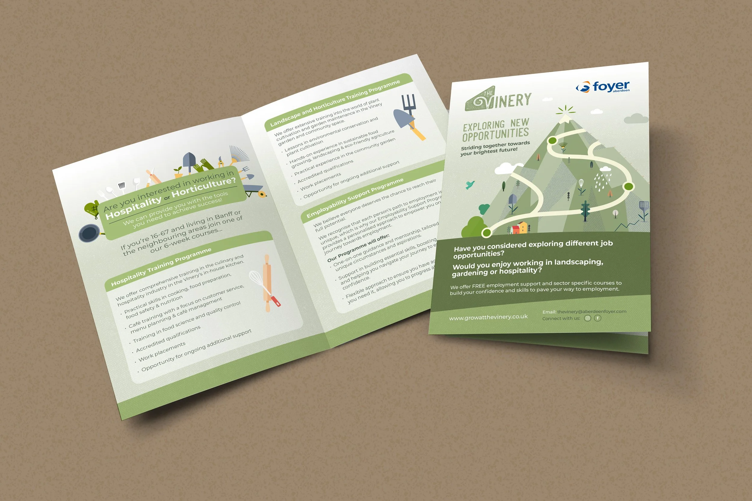
The Vinery

The Banff Vinery, managed by Aberdeen Foyer is a community space that provides opportunities for children, young people and families to take part in valuable health and wellbeing activities.

The space has been designed to accommodate a variety of therapeutic activities to increase employability skills, digital skills, learning opportunities, accredited training and work experience. The garden and Vinery space provide both indoor and outdoor space for growing and gardening opportunities. The beautiful open plan kitchen space and café area provides opportunities for community learning, cooking and workshops.

The logo wanted to feel organic, with a growing font choice and stone texture. Soft colours and shape echoes the leaning greenhouse shape.

Vinery logo halftone vector final-01.jpg
Vinery FG Social 2.jpg
Vinery FG Social 1.jpg
Vinery FG Social 3.jpg

St. John's Episcopal Church

We were asked to design a logo for the Church that would welcome everyone through its doors. Inclusive of ALL, no matter their beliefs and create a community of people supporting each other. The building and its features inspired the team and the final logo chosen was using the window details and shades of diverse colour.

St John's logo stacked.jpg
St John's pop up banner.jpg
St John's web.jpg

Visit Aberdeenshire

We were approached by Visit Aberdeen to create a new identity for their tourism steer. They required a distinct, bold and visionary logo that represented the North East and its highest recorded hours of sunshine! It also needed to be adapted and used across a variety of digital and printed promotional materials.
Working with Visit Aberdeenshire for many years we’ve designed and produced an array of branded materials from tourism booklets, city maps and banners to interior glass vinyl, airport adverts and tote bags. We have worked alongside Web Integrations and the Leith Agency on their advertising campaign, continuing to service and develop their ever-growing brand. 

VA logo 2018.jpg
VA web site.jpg
VA display.jpg
VAmobile and leaflet.jpg
Aberdeen City map drawn
Aberdeenshire Map drawn
prev / next
Back to Branding / Logo
OEUK-thumbnail-slow.gif
8
OEUK Event Branding
OSA-thumbnail.gif
4
Offshore Safety Awards 2025
Logo.jpg
4
NHS Grampian Charity
HFM_logo_on White.jpg
3
Halliday Fraser Munro - Logo design / identity
cfine-thumb.gif
2
Cfine
col on blue.jpg
2
Elements Restaurant
Whisky Festival branding
9
Spirit of Speyside Whisky Festival
HDT Banner.jpg
6
Huntly Development Trust
HFI+Folder+Closed.jpg
5
HFI Consulting & Legal Services
image.jpg
3
Young Carers Aberdeenshire
image.jpg
2
Ternan Energy
4
Lightbulb Coach
GCC.gif
2
Granite Care
Vinery logo halftone thumbnail-01.jpg
5
The Vinery
St John's logo stacked.jpg
3
St. John's Episcopal Church
6
Visit Aberdeenshire

Terms and Conditions / Privacy Policy and Cookies